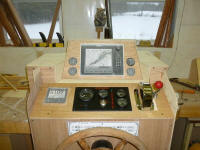
Project Log: Saturday, January 21, 2012
I continued my cut-and-paste approach to the new helm
mockup. I'd been spending a lot of time on the
helm area and various mockups because I felt this was a
critical feature of the boat--both for function (first)
and aesthetics.
I felt there was room for improvement over my original
(version 1.0) setup using a tall console entirely above
the "dashboard". Version 1.0 worked, but
ultimately wasn't giving me what I really wanted, so
earlier I'd started down the road towards my vision of
an partially-recessed electronics console (version 2.0).
I had the basic idea, but the details had to work
themselves out on the fly. While the end result of
those efforts hadn't quite fit the bill, the process had
led me in the right direction, and had given me a good
starting point for the next revisions. |

 |
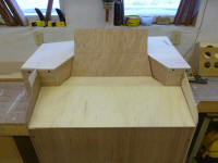
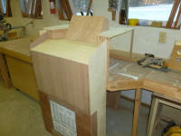
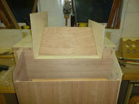
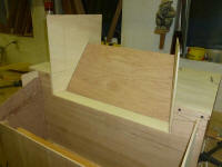
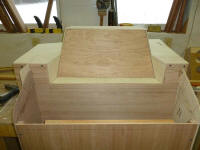
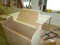
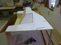
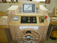
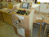
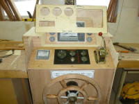
Beginning with the net result of last weekend's work
(seen in the photos above), I made some changes, which
I'll refer to as version 2.1. The version above
was more or less right in terms of proportion and
concept, and was recessed to the practicable maximum
amount for which there was room (thanks to a 5" depth
restriction in order to stay above the main saloon
overhead), but I wanted to make it more streamlined.
I felt the path to this desired end began with extending
the angled sides of the recess all the way to the back
of the raised portion of the console, with a
corresponding change in the shape of the electronics
mounting surface itself.
After some layout, I cut oversize pieces of scrap
plywood to form the new angled sides and tacked them in
place with hot glue, then worked out the shape and
angles required for the new mounting surface. |

 |
With the pieces joined together, I made the final cuts
to bring the new sides flush with the dashboard and
console as needed. I feel compelled to keep
mentioning that because this design process was entirely
minute-by-minute, the construction details of the mockup
were intended to provide basic appearance and proof of
concept only, not precise templates for future use. |


 |
Another change I wanted to make to version 2.0 was to
return the angled engine instrument panel to its
original 20° angle, rather than the shallower angle I'd
tried. I'd considered running the angle all the
way up to the base of the electronics console (in place
of the narrow horizontal "shelf"), but this would have
caused the cutout at the bulkhead to end up too deep to
stay within my 5" maximum. I could have gotten
around this by raising the recessed console accordingly,
but that would defeat the main purpose. With a
small fiddle, I thought the horizontal area could
possibly prove handy for storage of incidentals.
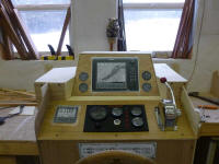
I laid out the position of the new 20° panel and cut the
vertical front panel of the helm console commensurately
shorter to accommodate the new position, then installed
the plywood panel I'd originally made for version 1.0.
However, I made some minor changes to the installations
in this panel, filling in the holes I'd cut for the fuel
gauges in favor of installing the autopilot control head
in that space. For the moment, I moved the four
round gauges up to the sides of the electronics console,
though I was considering some other locations as well.
I'd get to all that in more detail later.
To be sure the whole layout worked as intended, I
temporarily installed the helm pump and wheel once more,
along with properly-sized printed simulations of the
electronics and gauges to allow for easy positioning and
repositioning of the basic installations. |


 |
I liked the new appearance and functionality. The
recessed console was far less bulky, and even more
useful as redesigned. One may note that I'd
not yet provided space for the sailing instruments (two
4.5" square instrument heads) and VHF radio, but I had
other ideas in mind for those, though precisely how and
where these would end up would remain to be seen based
on additional mockup work.
For comparison, I placed the original (version 1.0)
electronics box on top of the new mockup. the
reduction in bulk was substantial and pleasing. |
 |
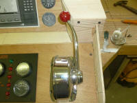
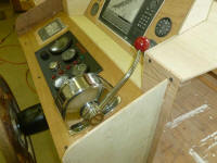
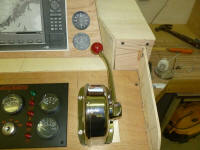
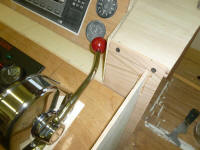
As before, I tested the throttle lever operation and
clearance. Its existing position just barely
missed clearing the new angled cutout. |

 |
I didn't yet know how much of the lever travel would
actually be required when connected to the engine, but I
didn't want any undue restrictions on the operation.
So I moved the throttle assembly slightly to the left so
the lever would clear the cutout and provide full travel
ability. |

 |
Late in the day, I began some early layout for a box to
contain the sailing instruments and possibly VHF.
I was considering an overhead box, located above and
behind the center window in the pilothouse, but wasn't
yet sure how it would work out; clearance above the
window was fairly minimal, and there was also the
overhead hatch/skylight to contend with. I'd some
other minor changes in mind for the helm console as
well, which I'd effect tomorrow. |
 |
Total Time Today: 4.5 hours
|
<
Previous | Next > |
|
|
